
Last Seen Blogs
zynnmxx
blog.

irondoomdesign
IrondoomDesign

ofanya
𝑔𝑜𝒹𝓈 & 𝔪𝔬𝔫𝔰𝔱𝔢𝔯𝔰 !

kitchenwitchling
🌿🍫🥀

thenewstorys
The New Storys
Text
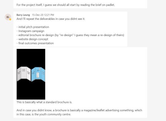
Unit 11 evaluation.
This unit was quite stressful if I’m being honest. Just because of the whole applying to uni thing. I’m glad that I have applied now and it’s all over but man I was panicking.
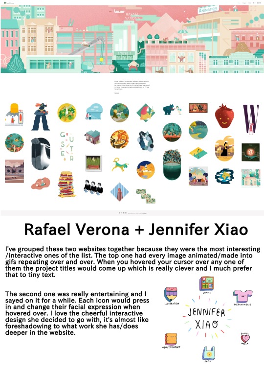
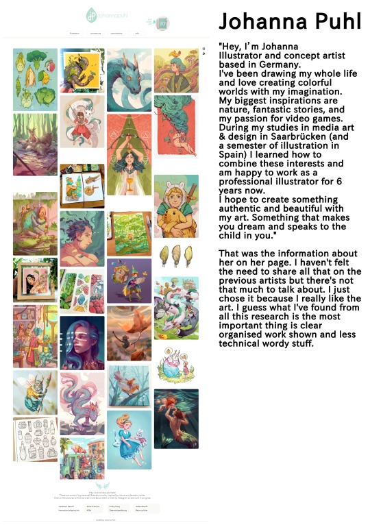
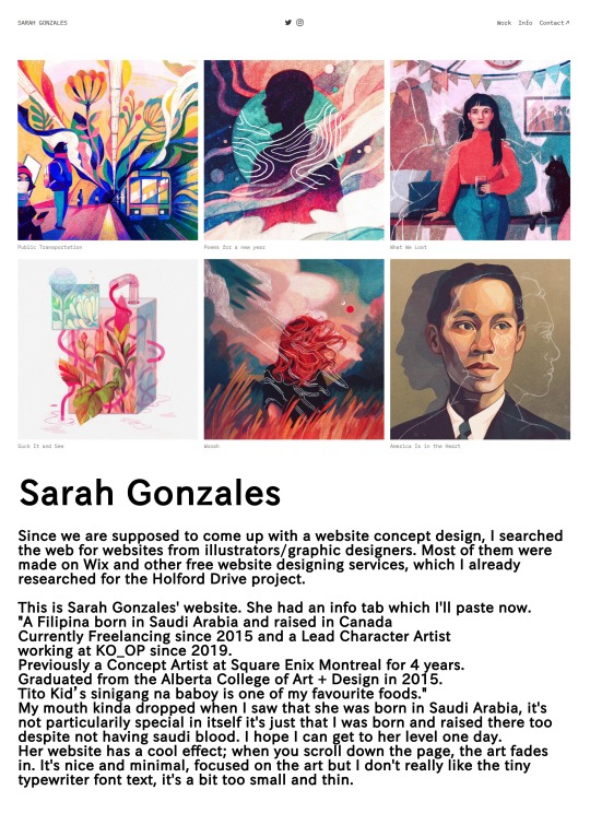
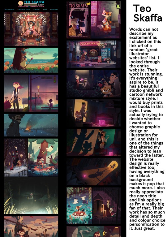
For my personal work/self branding, I made a portfolio, a logo and business card design, a CV, a website design and reflected on my year. I did research for all of these things, documenting the work of Jiji illustration who helped me massively with understanding what an aesthetic and effective portfolio looks like. Mohammed Beryl Alfaith helped me with a cuter illustrative styled CV. Arina Pramudita made a beautiful business card that mine could only hope to live up to, and Teo Skaffa took their place as my new favourite illustrator with a stunning website.
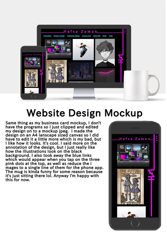
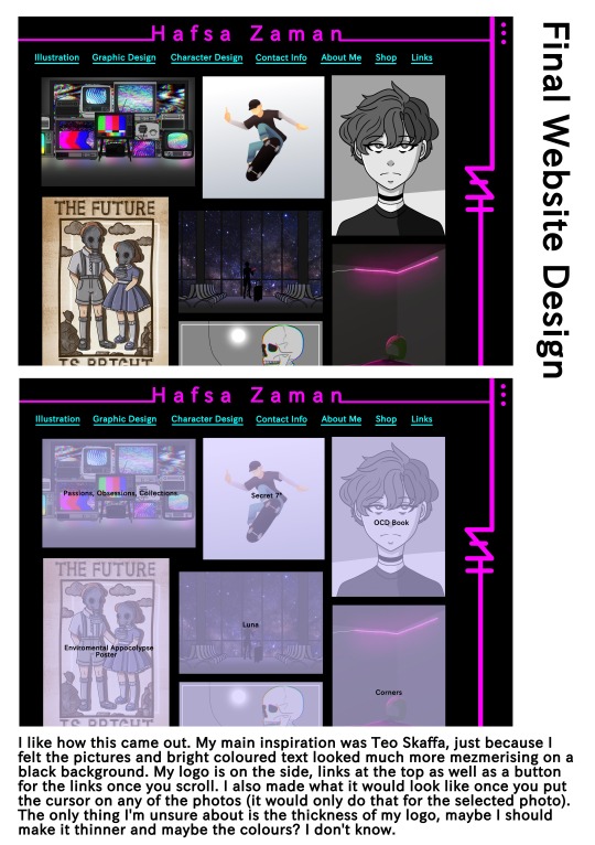
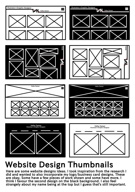
Making the CV, business card and website design was all pretty straightforward for me. They turned out to be pretty nice, I like them. If I could have perhaps actually made a proper website I think that would have been amazing. I also didn’t have photoshop to make a proper mock-up but actually managed to just make one myself. My CV is very colourful and cute, but I’m honestly not sure if it is professional enough. My business card and logo are actually kinda really cool, I might consider using them in the future as actual self branding, although I’m more into colour these days so I’d have to change it up a bit. The portfolio was something to talk about though. I went through a couple different phases before reaching my final one. Evidently, less is more, and I’m really happy with how everything looks against the black background. My personal statement was actually probably the hardest. I don’t really like praising myself too much so trying to advertise my expertise was a little annoying. I should be more confident though. I think I re wrote it at least five times before sending it off to my tutor who then sent it back for revision another couple times. In the end it turned out pretty good, I’m happy with it.
Applying for uni was a bit of a nightmare with things getting lost and me clicking the wrong things plus a thousand revisions of my personal statement. It all worked out in the end though, the universities I applied to seemed to like my portfolio and personal statement, I had three really good interviews and I’m all set up for next year now (I hope). I wish I could have applied for London and moved there, that’s probably the only thing I regret.
Along with this stuff we also had the group projects. The wandering project was one of my least favourite this year just because I’m not satisfied with the results. I feel like we could have done much better had the photography and fashion students tried a little harder. The stuff they sent seemed very unprofessional and whoever of the pair was in fashion didn’t show that part of it at all so we were set up for mediocrity from the start. My team members were all very chatty though so it wasn’t horrible working with each other at least. If we had more time and more communication with the other designers it’d have probably been a lot better. It doesn’t help that we had plans to collaborate with them directly which was cut short by a COVID isolation period.
Then we have HSD. This was actually finished over on unit 13 but I’m going to add it here since it started here (and I’m well over my word limit on there). To be honest. This was my least favourite work we’ve done this year. I was looking forward to work on a live brief but was let down by the anticlimactic responses of HSD. Their designs bore me and working to make them better with no help from their side until months later was kinda pitiful. I also had the extra added frustration of feeling like I contributed nothing to the group due to my lack of programs, which always has been the biggest issue for me. I did what I could, providing research and feedback but I wanted to get in on the designing and make it some of mine as well. I did end up making the phone website which is kinda cool, I also redesigned the logo but that was scrapped. We ran into some miscommunication issues as well in the beginning but it got resolved. I don’t hate our final brochure and other designs, just notice the creative differences between me and the team. The actual final presentation went quite well because it was super fast and they barely said anything, except they corrected us on the authenticity of the logo despite not telling us to do that in the first place so that was fun.
This unit was interesting to say the least. I’ve had experience working on a live brief and I’m going to uni next year hopefully so good things came out of it at least.
0 notes
Photo
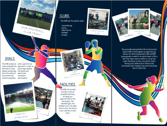
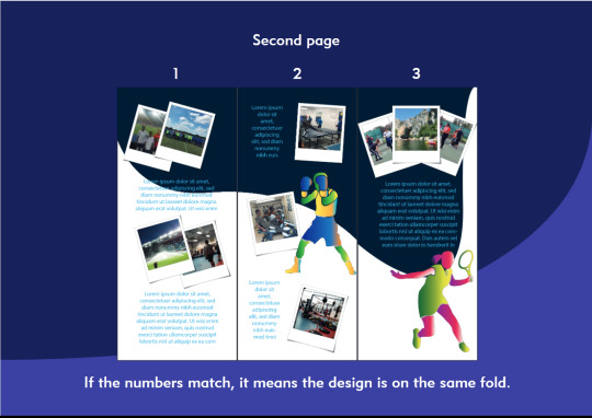
Here is the updated version of our presentation. I only added the slides that changed from the previous one. We had more to show this time but we did eventually cut it down once again to show more relevent material and also scratched the large amount of text.
0 notes
Photo
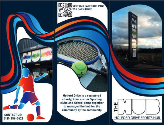

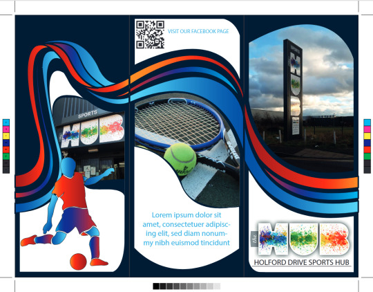


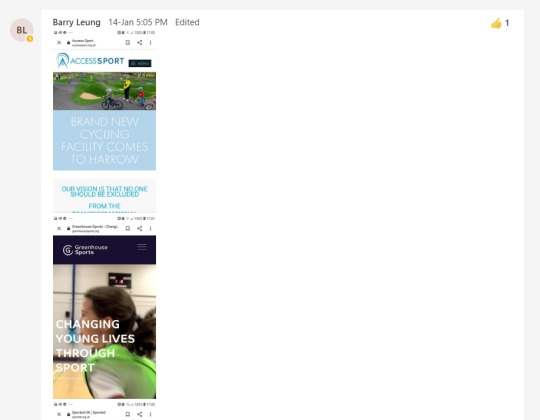
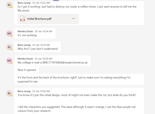
We changed the Lorem ipsum text to real text. I sent what we had found previously again. Barry worked on that and asked us about the positioning of the text too. He sent us the final product as wel as the previous one so we could see the difference between them.
0 notes
Photo
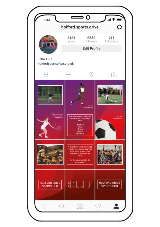

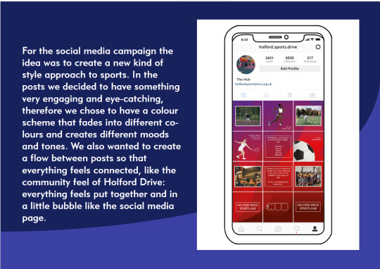
Here’s the rest of the posts. I ended up putting them onto a fake mock-up that I made myself. I don’t have process photos this time because when I wanted to change the positioning of the whole piece on the page, I merged all the layers together and saved it like that (I usually make a copy of the file before I merge anything) But it was just about positioning all the photos, drawing a grid on top of that and adding the profile picture and information. I tried to use a font that matched a real Instagram account so it would look as realistic as possible. I think this might have looked nicer on dark mode though.
0 notes
Photo


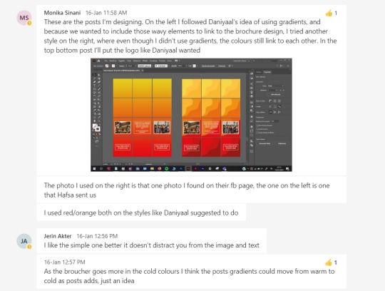
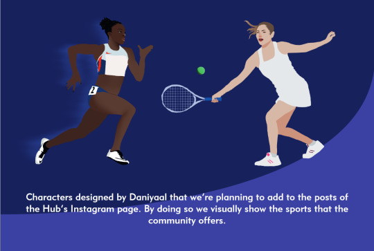
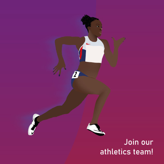
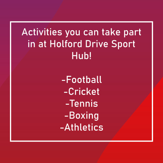
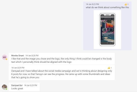
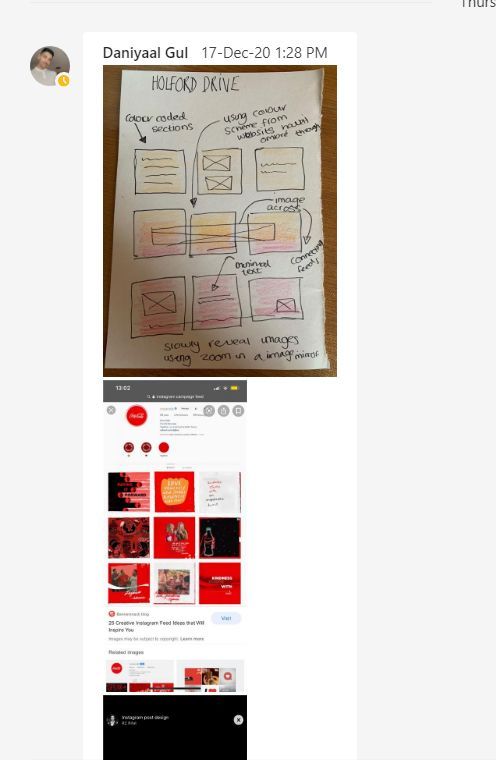
Then we worked on the instagram account. Daniyaal was sure he wanted gradients in the back so Monika drew that up. I chipped in and suggested we have both warm and cold colours in there to go with the brochure and all the research we looked at. Monika followed through and Daniyaal made the posts which I’m gonna have to split between two posts.
0 notes
Photo

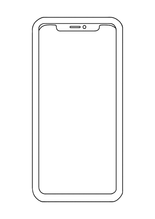
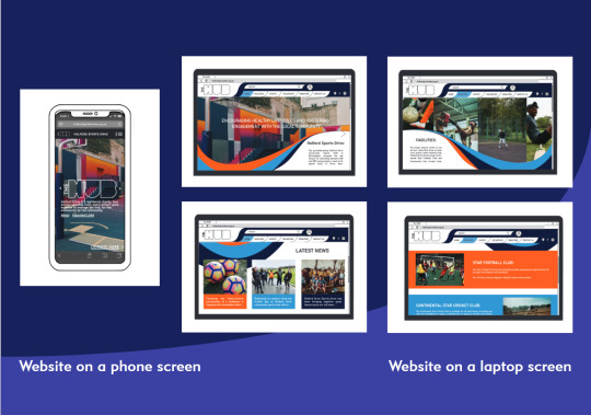
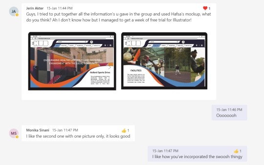
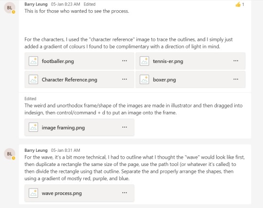
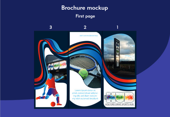
Here’s a GIF of my process. I drew the phone and then filled the screen in with red so I could clip everything onto there. Then added the stock photo and added a fake website HTML which I molded after the way they looked on my phone. Then I changed that because I didn’t like the look of it. I added the link tab lower on the top of the screen and redid the top part and added the bottom options as well. Finally I added the logo in the middle and a brief description as well as underlined information to represent links. I also added a clearer picture of Jerins designs that she modeled after mine.
0 notes
Photo
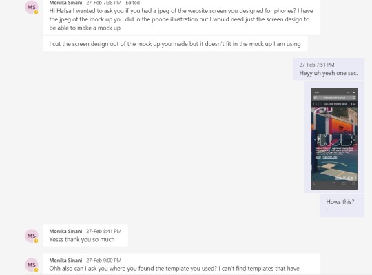
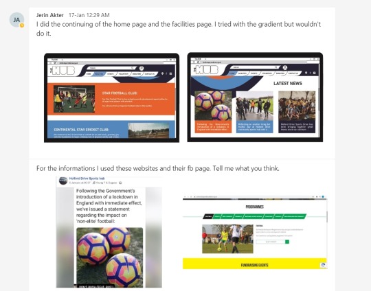


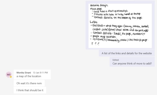
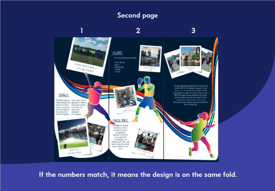
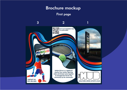
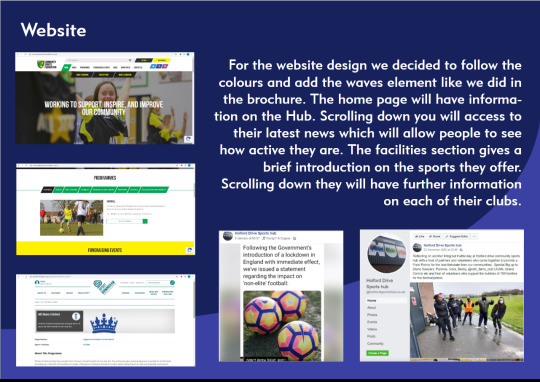
Then we worked on the website design. I made a quick list of all the links I believed their possible website might need as well as some details I thought would be cool. Barry and Monika also sent some research on websites to help. I ended up designing one for the phone (which I will annotate in the next post) and Jerin followed that design as well as the brochure to make the desktop website. She made a home page and also designed some of the links too. Monika also asked for the flat image so she could fit it on to a real mockup because I cannot do that with my lack of programs.
0 notes
Photo
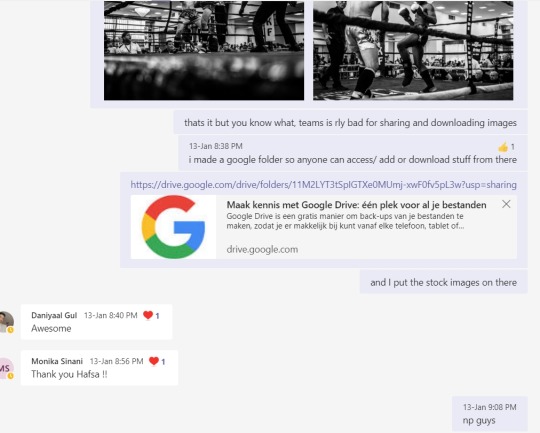

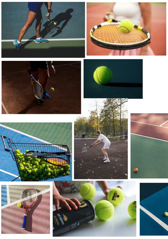
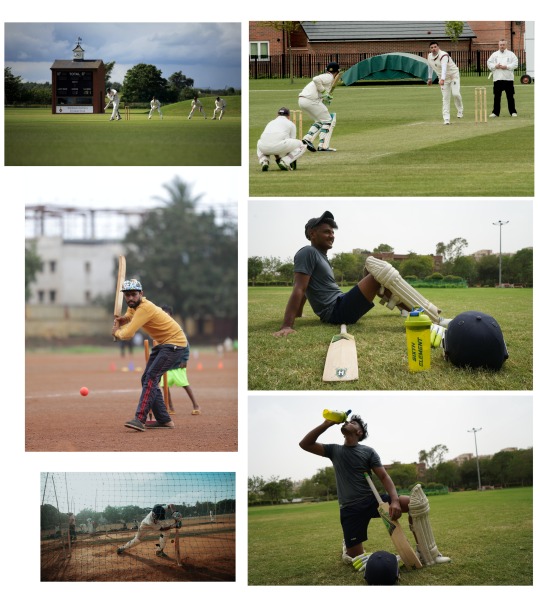
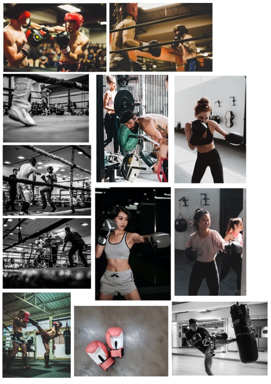
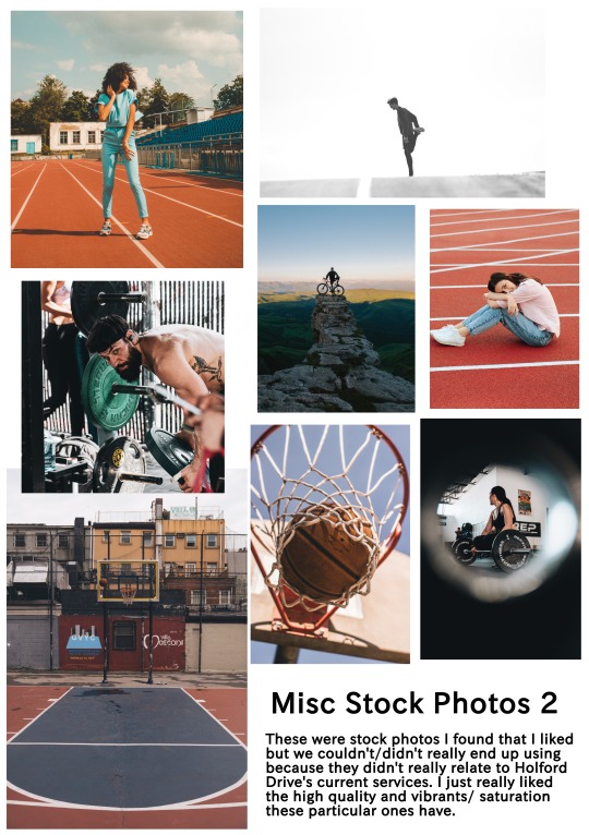
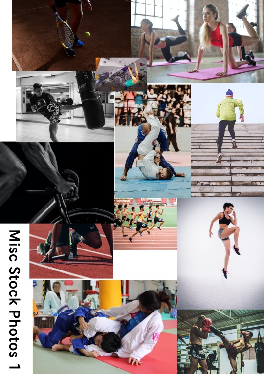
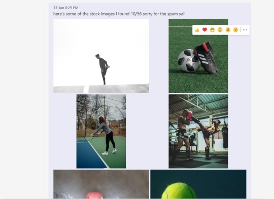
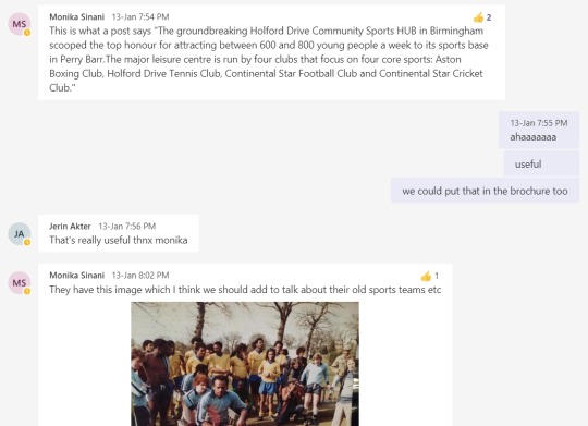
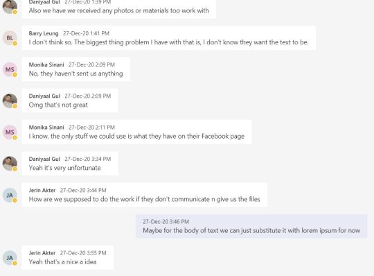
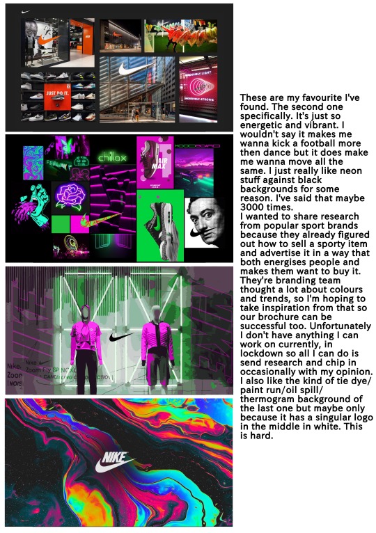
Another problem we had was the lack of imagery given from our client. I went online and found some copyright free stock images and shared it with my group as well as make a google drive folder for all of them because Teams is horrible for sending and downloading images. I made sure to pick images that related to the four activity centres Holford Drive holds, as well as some random ones that I personally liked in case we wanted to use that as well. I made a collage of each group of photos so it’d be easier to upload here.
0 notes
Text
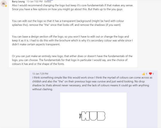
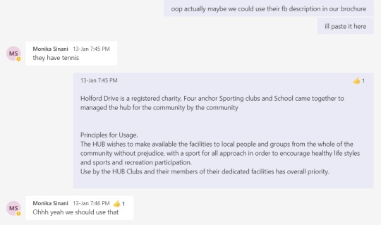

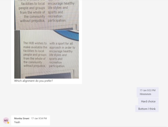
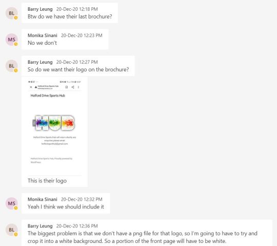
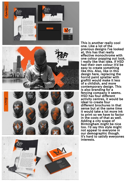
We discussed what we should do about the text inside the brochure. Monika and I searched them up again to find any kind of written information we could and sent that back. I found their Facebook description but it was horribly written. I’m sure I rewrote it myself but can’t find that anywhere. I also redesigned their logo because I thought it desperately needed a revamp. I went for a more minimal look so it’d fit better anywhere it’s put. The group agreed and liked that.
0 notes
Photo


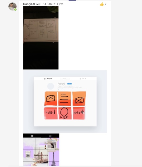
Daniyaal started working on the social media stuff; drawing “posts” for Instagram etc. We also discussed our group name since we really needed one, it was so hard trying to choose one that didn’t sound cliche and boring and also wasn't too random. Barry also sent some progress pictures of his work but all the files were corrupted or just not working on my ancient computer :(
0 notes
Photo
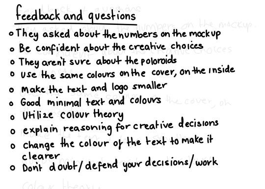
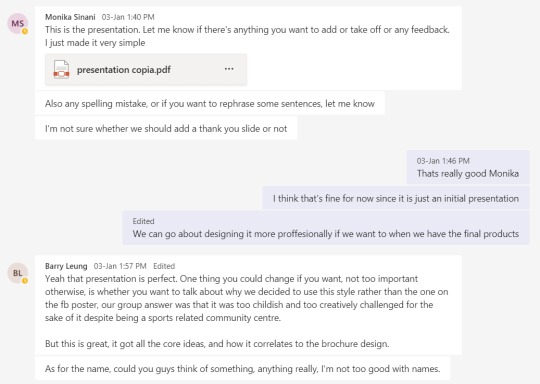
Then Monika made our first presentation. She compiled all our work and research to show our work flow and added the brochure design. We showed this to our class and I jotted down the feedback they gave on my drawing tablet because that’s what I had handy in the moment. It seems that there was a noticeable nervousness we gave off when presenting so we need to work on that, as well as a couple things on the actual brochure.
0 notes
Photo
The last bit of research wouldn’t fit on the previous post so I’m just adding it here.
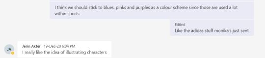
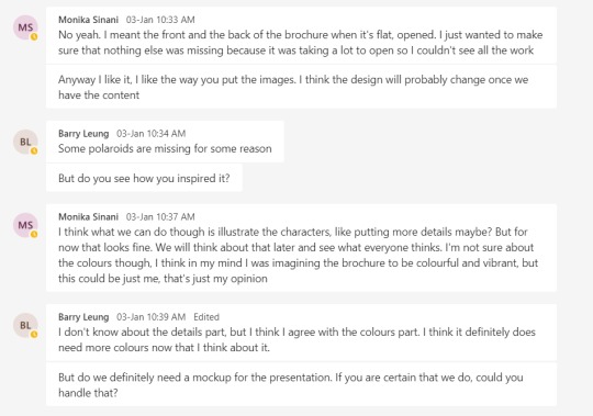
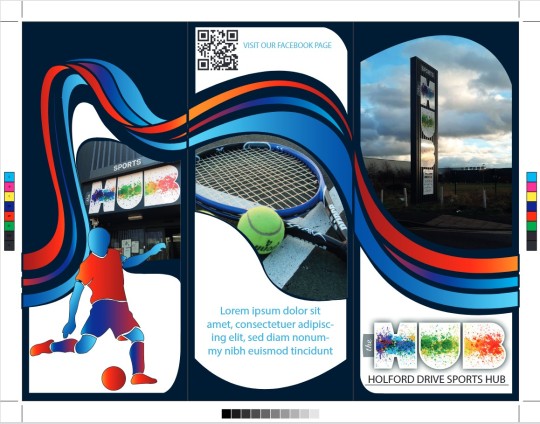
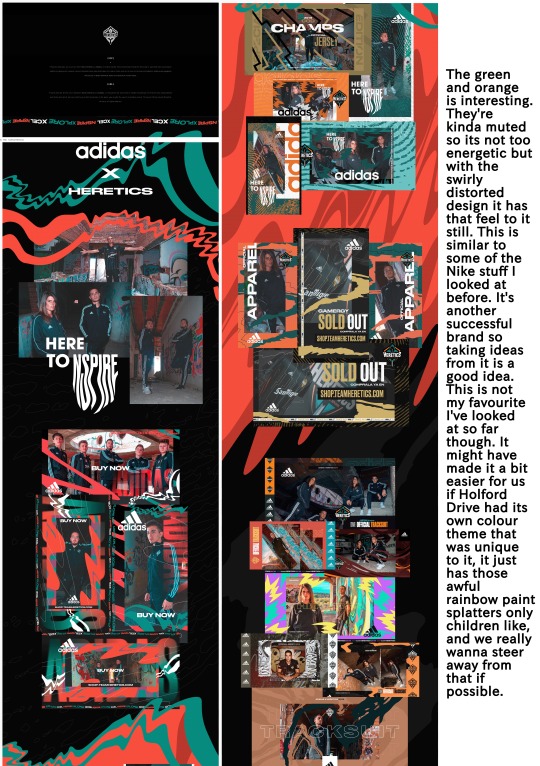
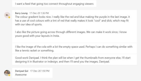
After discussing more things like the logo and colour scheme, Barry made the first draft of the brochure. We had a bit of a miscommunication with Barry unfortunately; he thought he was the only one with the programs so started working by himself and he did not get back to the group for opinions or discussions. He did use the other members thumbnails to make this though. It’s all cleared up now, he won’t be changing anything without getting feedback from the group in the future. We all liked his first draft, especially the swirly designs and gradient characters.
I’m also adding the updated project proposal here too. edit: I realize I’ve forgotten to add everyone's names at the top, I’m not sure if that is necessary but pretend they are there.
0 notes
Photo
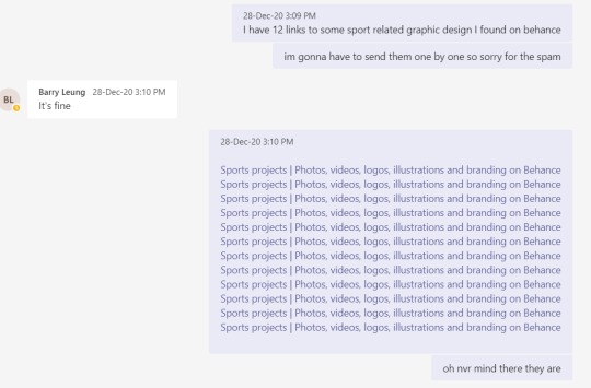

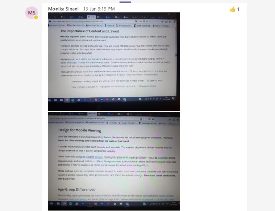
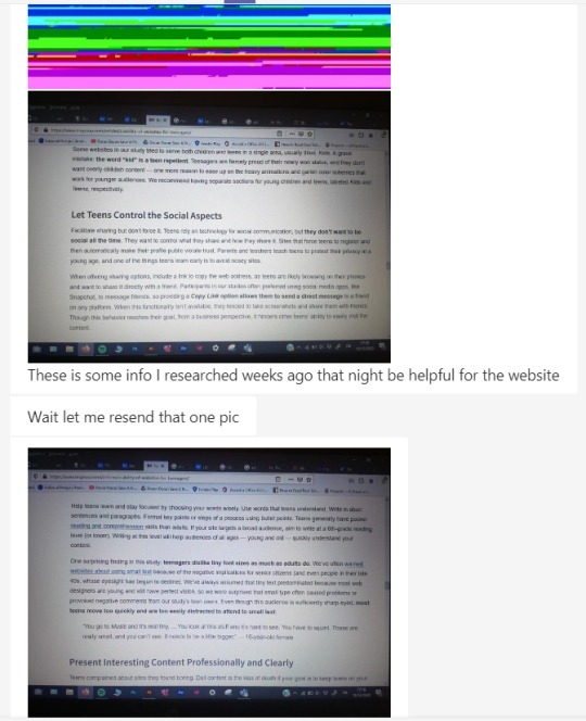
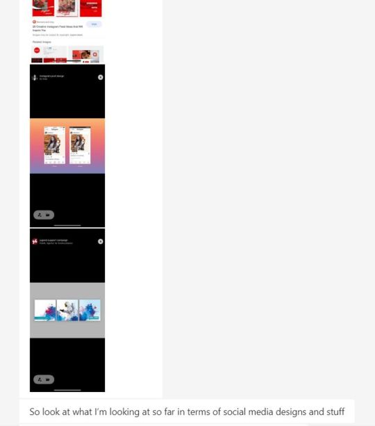
I shared some links to research I found (I annotated them myself afterward) which might be useful for the design of our brochure/social media account/ website. I have none of the programs at home, so I could not work on the actual products and had to try and contribute in other ways like this and just chip in sometimes with my opinion or help in any way I can. (these aren’t in order)
0 notes
Photo

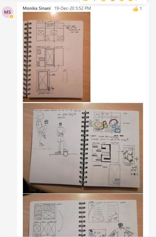
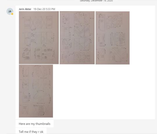
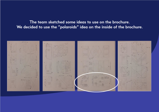
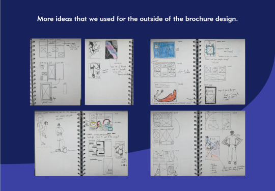
Everyone went off and drew up some thumbnails of what they wanted the brochure and Instagram account to look like and sent it back to the chat so we could get some ideas going. Monika also shared some research she liked and to also explain some bits in her thumbnail sketches.
0 notes
Photo
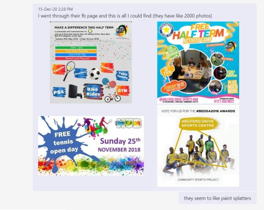
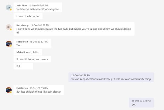
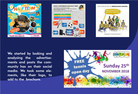
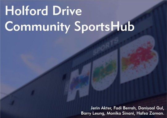
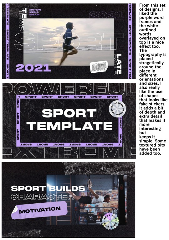
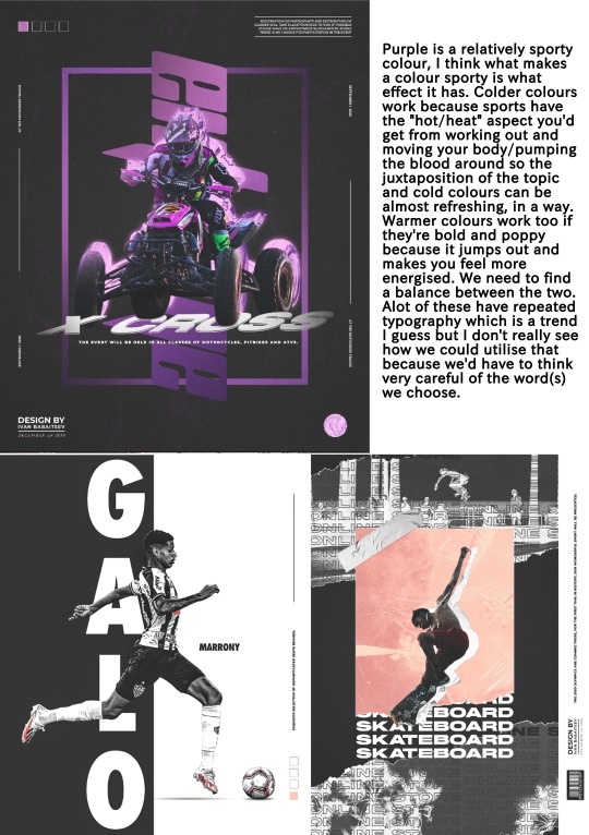
The first discussion on our Holford Sports Drive project Teams group chat. We discussed what we were going to do and I shared my research I did on the client so we could get a feel for what they wanted, based off of what they already had. They seemed to like colour and paint splatters, which we all agreed was a little childish and more like an art centre rather then sports.
0 notes
Photo
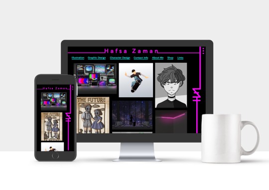
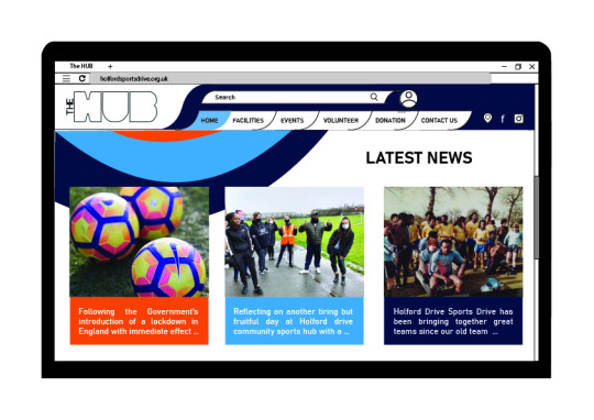
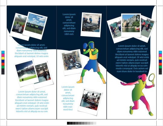
Final Website Design and Mockup
Also, here are my reflective journal questions I didn’t get to design properly:
What is the difference between good and bad design?
-Good design comes down to how well the product encapsulates and represents the thought process behind it. Contrarily, bad design takes no consideration into composition or colour choices, over looking the demographic, and generally not following through on the intended idea.
Failures
-Falling behind on blog work.
-Not being able to find alternative programs.
-Having trouble keeping the problems I have at home from affecting my work.
-Needing extensions to complete work.
Successes
-Coming out of my comfort zone.
-Being a lot more experimental.
-Getting into uni.
Collaboration vs individualism
-They both have their advantages and disadvantages. Whilst I mostly favour working and relying on myself to get work done in a way that is satisfactory to my preferences, operating in a team helps pick up any slack that one might manifest on a gloomy day, as well as provide a second or third opinion on something that could otherwise become biased.
Analogue vs digital
-The authenticity and overall engraved satisfaction in creating a traditional piece of art is something I crave but as someone who has problems with constantly shaky hands, I can’t help but adulate the technological advancements that help such issues, and utilise those functions to assist my work flow on a daily basis.
Real vs screen /in person vs internet. Can digital experiences be equal to in person experiences?
-There may be a deeper connection created when meeting in person, but unless you need to constantly be making contact of some kind, I think for business/college meetings at least, there isn’t much need for anything physical. That does differ when it comes to the lack of cameras for course. Seeing a persons facial expressions is quite important for keeping the conversation flowing, rather then having to guess and wonder if the recipient is even listening. Also I think from a scientific standpoint, there are negative effects from being alone all the time and never physically talking to someone.
Influences and inspiration
-@baomii
-@knivesmeow
-@ellespazz
-@beeple_crap
-@leafandoetaldesign
These artists have and will continue to influence and inspire my art style and help me be more experimental and open to trying new things.
Experiences that changed your design perspective, can design change the world?
- The project we did on Bit Rot provided me with a different view of design by making me create something out of my usual area of expertise. It opened my mind to the possibility that not everything has to be perfect and that intentional asymmetry is actually kinda nice. The answer to whether or not design can change the world is already apparent. From the design of the wheel to the next generation of smartphones, everything had an idea, a design, and an execution. I believe there will be many more life changing designs from brilliant minds across the world yet. If you’re talking about graphic design changing the world I’d say that I do believe that could work as well but perhaps starting as something small, blossoming into a chain reaction, gathering more momentum as other designers join in to spread whatever message is portrayed until it has enough impact to make a difference. Sometimes the visuals have a greater effect then words themselves.
What are your design ambitions?
-It is my goal to become a freelance illustrator and small business owner working out of a one bedroom studio apartment somewhere nice. After seeing so many you tubers living that exact life, I can’t help but start to want it too.
0 notes
Photo
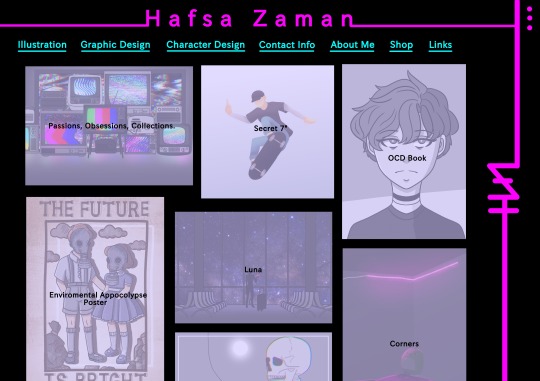
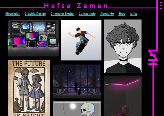
Website Design, Research and Development.
0 notes