
scooplery
perpendicular honk engine
liz, 31, maine. she/it. icon by @mlekonya
49345 posts
Don't wanna be here? Send us removal request.
Last Seen Blogs

goth-brushbug
🦇Vesper🦇
stykz
- ̗̀oh my stars! ̖́-

amberpokli34989
Untitled

lazydens
lazydens

korrels
Hi I’m Kor
Text


LAUREN LONDON & T.I.
ATL Movie (2006)
3K notes
·
View notes

Text
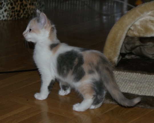
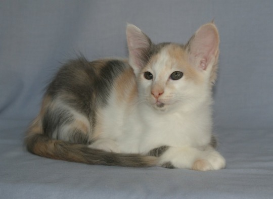
S*Jijumas Oracle Camilla [Pedigree]
🐱 Oriental Longhair
📸 Monica Molinder [S*Jijumas]
🎨 Blue Tortoiseshell Bicolor
102 notes
·
View notes

Photo
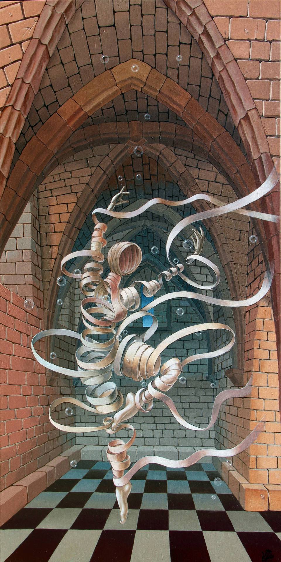
Victor Molev (Russian,b.1955)
Great ghost of Caesarea, 2016
Oil on canvas
596 notes
·
View notes

Note
hi!! I’m a teenager who’s also transmasc and also loves painting! :D
I was wondering how you choose what colours go good with each other for the added contrast and depth and things; I’m really bad with colors.
Hi! Couple things I try to keep in mind when painting when it comes to colors:
1. Warm colors come to the front and cool colors get pushed backwards, same thing with saturated and muted colors. To bring something from the forefront i try to keep them brighter and warmer, and make my backgrounds the opposite!
I made this eel super bright and kept the background fairly grey:
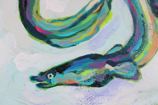
2. Higher contrast areas become the focal point. Sometimes your reference might not look that way but you can push the contrast to tell viewers what to look at
For example in this painting I wanted people to look at the head first, so I added a lighter blue outline to the face to make it stand out more:
3. For stylizing colors I tend to adjust the saturation in my reference photos to bring out the undertone of the colors and then push that as far as it can go. I feel like this is really evident in some of my old portraits in the skin tone where sometimes I’m using green/blue/purple. Id say value is still the most important factor though, even if your color hues are off value will fix it!
38 notes
·
View notes
Text
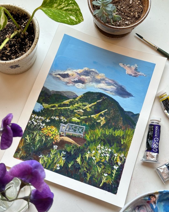
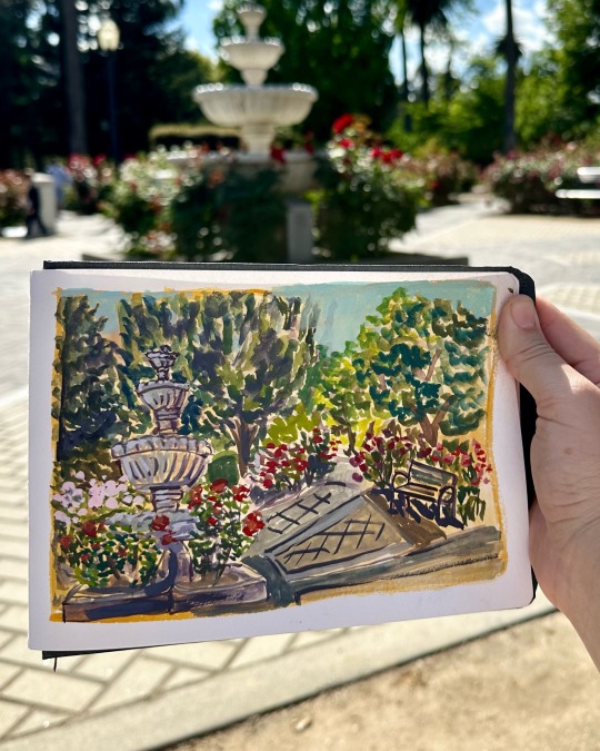
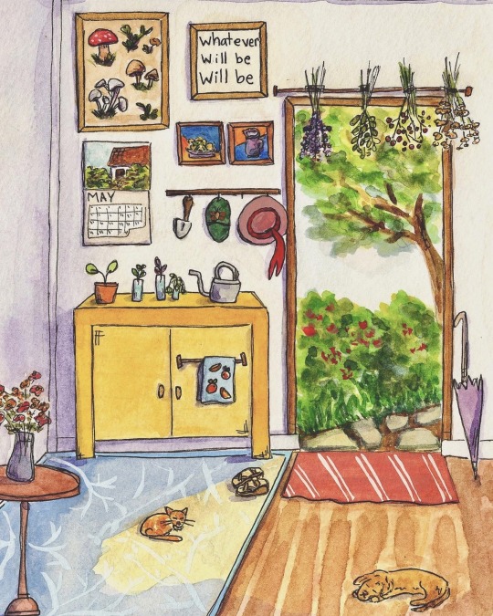
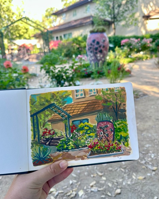
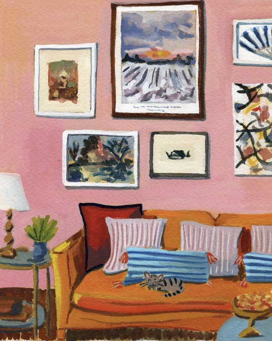
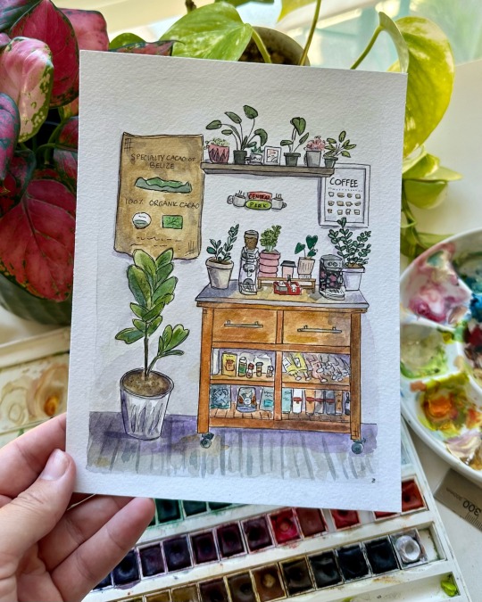
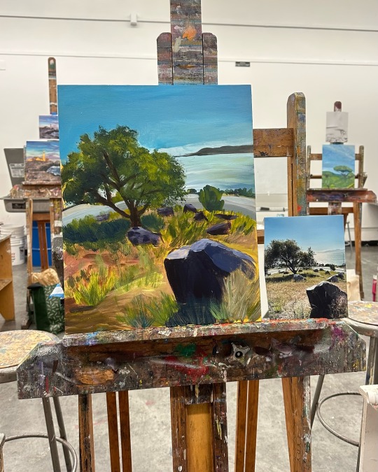
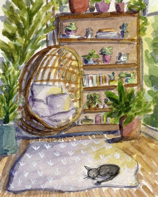
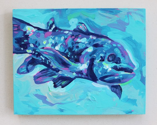
all the paintings I worked on in May :')
116 notes
·
View notes

Text
I finally made my first yarn wig after 10+ years of crocheting my cosplays...
5K notes
·
View notes
Text
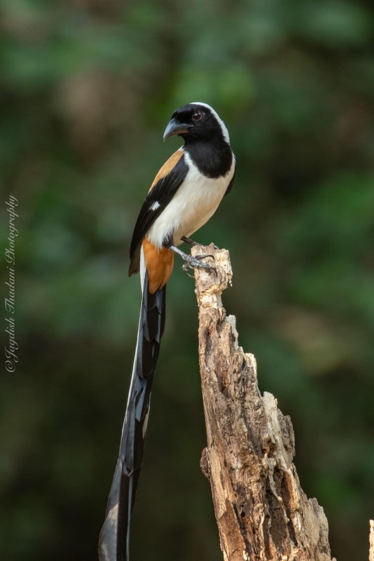
White-bellied Treepie (Dendrocitta leucogastra), family Corvidae, order Passeriformes, Kochi, India
photograph by Jagdish M Thadani
413 notes
·
View notes
Text
girl dinner (big fucking plate of carbs and protein) girl math (complex analysis) girl career (trades and engineering and politics and compsci) girl sports (dirtbikes and football and weightlifting) girl instruments (drums and bass guitar and electric) girl personality (loud and opinionated and annoying and brash)
18K notes
·
View notes
Text
crossfaded on a pastry + a little drinky drink
6K notes
·
View notes
Text

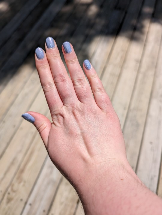
this week's nails 👾
19 notes
·
View notes