#cass trying to take the spotlight and somehow fading into the backgrounds more than ever
Text
The more time that passes since the reveal of the ‘moon cassandra’ design the less I like the look of the “suit”. In big action poses where the limbs are all out and visible it’s fine. Or when she’s standing still and her arms are at her sides.
But anytime any of her body parts overlap they mush together into a big black blob. Especially on dark backgrounds, which was where Moonsandra spent most of her time.
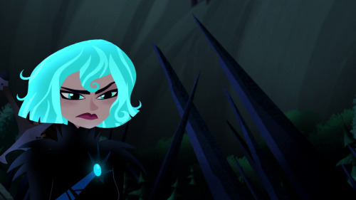
her body completely fades into the background which is ironic. because this was supposed to be her ‘standing out on her own’. Looking at the below stills it took me a moment to find her left arm in the shot. Or her legs in the second one. She spends a lot of time in stills looking like a floating head.


Everyone else has some level of contrast that helps them stand out but it seems like the only part about Cass’s design that was meant to stand out was her hair. Edmund even, who is also wearing all black armor, has purple lighting accents on it and wears a cloak in a different color to add variation. When he’s on a black background you can still see his shape. It seems like the problems with this arc go all so deep that even on a technical animation/design level they didn’t know what to do with her. The main villain of the show shouldn’t be blending into the backgrounds there should be something to make her POP
This isn’t me bashing the animators obviously. they animate what they’re given they don’t decide what the backgrounds look like or how the characters are designed. This is another one of those ‘this comes from the people at the top’ issues because this was one of many designs they could have gone with and this was what got approved.
#long post#not tagging because this is just a personal observation#but anyone can reblog it if they want#it's a good design... if it's static and on bright backgrounds only#otherwise it is not a good choice for a character who mostly operates at night and in the dark#she's not fucking batman#but even batman you can see because he has dynamic shapes and the artists make sure you can FUCKING SEE HIM#cass trying to take the spotlight and somehow fading into the backgrounds more than ever
163 notes
·
View notes
Last Seen Blogs

cosmicjiver
Gender Collector 🌞


skinnyluv-xo
*not Pro Anything*

terricolaignorante
TERRÍCOLA IGNORANTE